The word arrived before the movement had a name
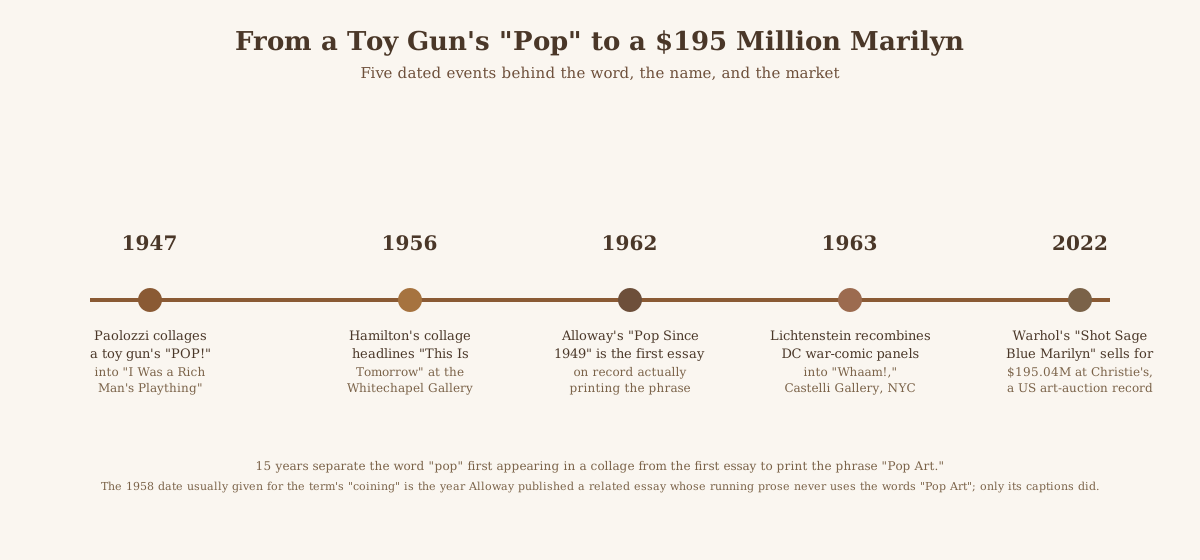
In 1947, more than a decade before anyone wrote the words "Pop Art" down, the Scottish artist Eduardo Paolozzi pasted a stack of American magazine cuttings onto a card: a bodybuilder-style pin-up, a cherry sliced next to a wedge of cherry pie, a "Real Gold" lemon-juice logo, and a hand-drawn revolver firing a cartoon burst of the word "pop", clipped from the packaging of a toy pop-gun. Tate, which now holds the collage, catalogues it as I Was a Rich Man's Plaything (T01462) and treats it as one of the earliest works to anticipate the movement, well before the movement existed as a labelled thing to anticipate.
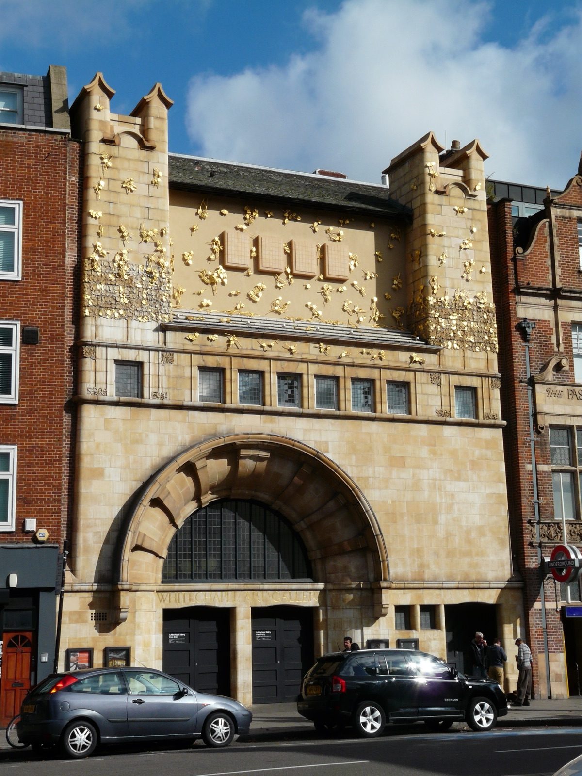
The more famous founding image came nine years later, in 1956, when the English artist Richard Hamilton made a small collage, only 260 by 248 millimetres, to illustrate the catalogue for an exhibition called This Is Tomorrow. The show opened at the Whitechapel Art Gallery on 9 August 1956, organised by the architect Theo Crosby together with members of the Independent Group, the London discussion circle where Hamilton, Paolozzi, and the critic Lawrence Alloway all argued about mass culture. Thirty-eight participants split into twelve groups, each building one installation; the private view was opened by a robot, and the show drew roughly a thousand visitors a day. It was also, by most accounts, the Independent Group's last collective act; the group never formally met again. Hamilton's collage, titled Just What Is It That Makes Today's Homes So Different, So Appealing?, is now in the collection of the Kunsthalle Tübingen in Germany.
The gap between those two dates is where the standard history gets soft. Alloway is routinely credited with coining "Pop Art" in a February 1958 essay, "The Arts and the Mass Media", published in Architectural Design. Read the essay's running prose and the phrase is not there: Alloway writes about "mass popular art" and "pop culture", not "Pop Art" as a two-word proper name. The art historian Nigel Whiteley, introducing a 2004 Artforum reprint of Alloway's later essay, notes that the phrase did appear in the 1958 piece, just confined to its picture captions rather than the argument itself. The earliest essay on record that prints the literal phrase in running text is a different Alloway piece, Pop Since 1949, published in Artforum in October 1962 - four years after the date usually given for the term's invention, and fifteen years after Paolozzi had already put the word itself into a collage. The same pattern, of an institution quietly correcting the popular story of a movement's first moment, turns up often enough in art history that it is worth treating any tidy coining date as a placeholder rather than a fact.
What actually separates Pop Art from a still life of a soup can
Tate's own glossary defines the movement in plain, mechanical terms: Pop Art emerged in Britain and the United States in the mid-to-late 1950s and peaked through the 1960s, and it "presented a challenge to the traditions of fine art by including imagery from popular and mass culture, such as advertising, comic books and mundane cultural objects." The point was not simply to paint a picture of something ordinary - painters had done that for centuries - but to import the actual visual language of mass production: advertising layout, packaging design, screen-printing, the newsprint dot pattern of a cheap comic.
That distinction matters because it separates Pop Art from illustration that merely depicts consumer goods. A still life of a soup can, painted in oils with visible brushwork, is a traditional genre with a new subject. What Lichtenstein and Warhol were doing was closer to appropriation: taking a specific, already-published commercial or comic image and re-presenting it, enlarged and reprocessed through a technique borrowed from commercial printing itself, so that the method of the picture argued the same point as its subject.
James Rosenquist made the same case at the scale of the source material he had actually trained on: he worked as a commercial billboard painter in New York before turning to fine art, and in 1964 and 1965 he applied that scale directly to F-111, an oil-and-aluminium painting in twenty-three sections that runs 86 feet long and was designed to wrap around all four walls of the Leo Castelli Gallery. MoMA's own account of the work, which now holds it, states Rosenquist was inspired equally by advertising billboards and by mural-scale painting such as Monet's Water Lilies, and reads the fragmented imagery of a fighter-bomber, a child's face, canned spaghetti, and a nuclear-test mushroom cloud as commentary on the Vietnam-era military-industrial complex. The billboard technique was not incidental to that argument; a painting about mass-produced spectacle was built using the actual trade Rosenquist had left.
Oldenburg didn't just depict a store - he opened one
Pop Art was never only a painting movement, and Claes Oldenburg pushed the appropriation past image-making entirely. From December 1961 to January 1962 he ran an actual storefront on New York's Lower East Side, called simply The Store, and sold painted plaster-and-wire reliefs of ordinary goods over a real counter - shirts, dresses, cigarettes, sausages, slices of pie - the earliest of which had debuted that spring at the Martha Jackson Gallery. He built them from chicken wire wrapped in plaster-soaked canvas and finished them in enamel paint straight from the can, the same materials a sign painter or a market-stall vendor might use, not the materials of a gallery sculptor.
The Store also introduced his soft sculptures: an oversize ice-cream cone, a wedge of cake, and a hamburger, sewn in fabric and stuffed with foam rubber by his wife, Patty Mucha, then painted by Oldenburg himself. He made them soft specifically to keep their bulk manageable at that scale. MoMA's founding director, Alfred Barr, bought one of the resulting works, Two Cheeseburgers, with Everything (Dual Hamburgers), for the museum's collection in 1962. Where Lichtenstein and Warhol reprocessed images that were already commercial, Oldenburg skipped the reprocessing step and made the commercial transaction itself the artwork, years before Warhol's own retail-styled Brillo Box sculptures made a similar point about packaging.
Whaam! recombines two comic issues, not one panel
By the early 1960s the initiative had crossed the Atlantic, and the American wing of Pop Art - Andy Warhol, Roy Lichtenstein, James Rosenquist, Claes Oldenburg - pushed the appropriation further than the British Independent Group had. Lichtenstein's Whaam!, a 1963 diptych in Magna acrylic and oil measuring 172.7 by 406.4 centimetres, is usually summarised in one line as "based on a war comic panel", singular. The base panel is Irv Novick's art for "Star Jockey" in All-American Men of War #89 (January-February 1962), but Lichtenstein did not simply enlarge that page: at least one more artist's work went into the finished picture. Where the record gets genuinely uncertain is exactly how. Following research by the comics historian Paul Gravett, Wikipedia's account has Lichtenstein substituting the attacking aircraft with art from Jerry Grandenetti's "Wingmate of Doom" in the following issue (#90, April 1962), and the target aircraft with a separate Russ Heath panel from "Aces Wild", also in issue #89. A second history of the painting, focused specifically on its aviation detail, agrees on the same two artists and issues but assigns the Novick and Grandenetti panels the other way round, and does not mention a third source at all.
What survives across both accounts, disagreement and all, is the fact the shorthand version erases: Whaam! recombines panels from at least two different comic-book stories, by at least two different artists, published a month apart, not the single panel "based on a war comic" implies. Whaam! was first shown at Leo Castelli Gallery in New York in 1963, purchased by the Tate Gallery in London in 1966, and has been on almost continuous display since, now permanently installed at Tate Modern. Reading the catalogue record rather than the popular summary of a famous work is what turns up this kind of multi-source detail in the first place; most general accounts compress it back down to a single source.
The mechanical look, made two different ways
Warhol's silkscreens, which he began producing in 1962, were genuinely mechanical. He selected a photographic source - a newspaper photo, a publicity still, sometimes his own Polaroid - and had it transferred onto a screen coated with light-sensitive emulsion. The screen itself was prepared by a commercial silkscreen maker, off-site, to Warhol's specified size and number of colours, then returned to his studio, the Factory, where he and his assistants pulled ink through it onto canvas as many times as they wanted. Because the ink coverage shifted slightly with pressure and registration on every pull, no two impressions from the same screen came out quite identical - a variation the process introduced rather than one Warhol painted in by hand.
Lichtenstein's Ben-Day dots, the newsprint-style pattern that reads at a glance as machine-printed, were the opposite: hand-applied. For Whaam! and his other early Pop paintings, he pressed paint through a perforated aluminium screen - by some accounts using a toothbrush to work oil paint through the holes - lifting the stencil to reveal a grid of dots underneath, then repositioning and repeating it by hand across the canvas. The dots that look like a byproduct of cheap four-colour printing were laid down one stencil pass at a time. Warhol's mechanical-looking prints were made by an actual machine process; Lichtenstein's mechanical-looking dots were made by hand pretending to be a machine. Each artist arrived at the same visual signal - industrial reproduction - by close to the opposite route.
The critique became the record sale
In 1964, the performance artist Dorothy Podber visited Warhol's Factory and found five just-finished silkscreen portraits of Marilyn Monroe leaning against a wall, each on a differently coloured ground: red, orange, light blue, sage blue, and turquoise. She asked Warhol if she could "shoot" them; he agreed, assuming she meant with a camera. Podber produced a revolver from her purse and fired a single shot through four of the five canvases, sparing only the turquoise version. The damaged paintings were repaired, and the incident gave the surviving series its lasting name, the Shot Marilyns.
Fifty-eight years later, on 9 May 2022, the sage blue canvas from that same shot series - Shot Sage Blue Marilyn - sold at Christie's in New York for $195.04 million, including fees, in a sale that lasted about four minutes. The buyer was the dealer Larry Gagosian; the seller was the Thomas and Doris Ammann Foundation, a Swiss collection. The price made it the most expensive work by an American artist ever sold at auction, overtaking the previous record for any twentieth-century work, Picasso's Women of Algiers, which had brought $179.4 million in 2015. A movement that began by dragging cheap, disposable, mass-produced imagery into the space reserved for fine art has, six decades on, produced the single most valuable transaction in the history of American art at auction.