A black-and-white painting he wasn't happy with
The Buffalo AKG Art Museum's catalogue entry for Convergence: Number 10, 1952 describes Pollock's drip technique in his own words, from a statement he made about laying canvas on the studio floor: "this way I can walk around it, work from the four sides and literally be in the painting." The same page adds a detail specific to this canvas: "Searching for something to follow his drip paintings, Pollock began working in black and white, which is the way Convergence: Number 10, 1952 began...Not happy with the result, he added color as a way to salvage the work." A small match is embedded in the paint near the center of the canvas, left there from whatever was on the studio floor the day he was working.
The art historian Jordan Kantor examined the layering more closely in a March 2016 Artforum essay, describing the finished canvas as having "two formally distinct registers": a first layer that is "a typical black pouring" with "an explicitly figurative (though overworked) image," then submerged beneath "a marbled network of dripped pools of colored paint, as if to overlay a painting from 1949 on top of one from 1951." Kantor's reading is that the two layers actively resist each other, "like oil and water," refusing to blend, and that the top layer's palette, three primary colors plus black and white, looks "artificial and disjunctive" next to both the "autumnal" tones of his 1950 abstractions and the austere blacks he'd been using more recently.
That black underlayer is why Convergence doesn't sit neatly inside the run of paintings, Autumn Rhythm, One: Number 31, and Lavender Mist, all from 1950, that most people picture when they think of classic Pollock. Those three came before a real interruption: in 1951 he set the all-over color technique aside for what his biographers call the Black Pourings, black enamel worked into raw, unprimed canvas, shown to little commercial success at the Betty Parsons Gallery. Convergence, painted the following year, isn't a return to 1950's method so much as an attempt to weld that abandoned black phase back onto full color.
Critics split in 1952, and they still don't agree
The museum's framing of the contemporary response is blunt: "In 1952, critics debated whether or not he had succeeded." That debate never fully resolved. Writing fifteen years later in a multi-part Artforum essay on Pollock, the curator William Rubin placed Convergence among the small number of paintings where he thought the artist's late push toward brighter color went wrong: "The reds of Convergence (1952) for example, have an unfortunate tendency to 'pop' optically out of pictorial fabric." Rubin was comparing it unfavorably to Number 12, 1952, a canvas from the same year and the same Sidney Janis Gallery show that he thought handled bright color better, before that painting was later damaged in a fire unrelated to Convergence.
Kantor's 2016 reassessment reads the same canvas as deliberate rather than botched. He calls Convergence "far from a nostalgic reprise," arguing that Pollock's return to his own earlier idioms "fiercely detourned" them, and that the painting stages "an image of the present occupied by a past that, although pervasive, can never be integrated or assimilated." When the Dallas Museum of Art hung Convergence as the centerpiece of the 2015 traveling survey Jackson Pollock: Blind Spots, the critic Phyllis Tuchman wrote in ARTnews that the surrounding black paintings in the show were hard to focus on next to it: "It's difficult to concentrate on most of these because they are overwhelmed by Convergence... its surface is a cavalcade of colors."
A separate, more political reading has circulated around the painting: that its energetic, individualist brushwork embodied a kind of Cold War-era "freedom of speech," a framing tied to the broader, genuinely documented argument that Abstract Expressionism benefited from informal Cold War cultural promotion. The art historian Yve-Alain Bois has pushed back on applying that kind of reading to Pollock's actual working method, on the grounds that it "fails to account for how Pollock allowed the forces of gravity and fluidity to direct the pooling and mixing of the paint" rather than compose it as a deliberate statement. Neither position has settled the argument; Convergence has been read as a technical stumble, a self-aware late masterwork, and a political allegory, sometimes by the same institution in different decades.
How a Buffalo collector ended up owning it
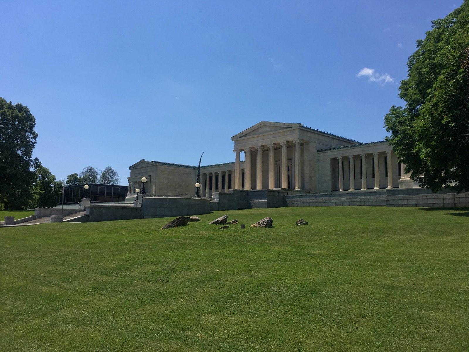
Convergence left the studio for the Sidney Janis Gallery, which gave Pollock his November 1952 solo show, one of three the dealer staged for him. From there the museum's own provenance record is exact: the gallery sold the canvas to what was then called the Albright Art Gallery on March 13, 1956, as a gift of Seymour H. Knox Jr., a Buffalo collector and heir to the F.W. Woolworth five-and-dime fortune who worked closely with the museum's director, Gordon M. Smith, on regular scouting trips to New York galleries through the 1950s and into the early 1970s. The gift closed five months before Pollock died in the August 11, 1956 car crash that ended his life at 44. The museum still catalogues the painting under that original accession number, K1956:7, and it has been renamed twice since, from Albright Art Gallery to Albright-Knox Art Gallery, honoring Knox, and again in 2023 to the Buffalo AKG Art Museum.
The canvas has kept moving through exhibitions since arriving in Buffalo, not sitting in storage: the museum's exhibition history lists it in shows running from Contemporary Art: Acquisitions 1954–1957 in 1957 through Action/Abstraction: Pollock, de Kooning, and American Art, 1940–1976 in 2009, and it traveled to the Dallas Museum of Art for the 2015–2016 Blind Spots survey discussed above. Nothing turned up in researching this piece to suggest any authentication question about Convergence; its ownership record runs unbroken from the November 1952 Janis show to the 1956 gift to the present day, without the kind of provenance gap that has clouded other paintings attributed to Pollock over the years.
The world's most difficult puzzle
In 1964, twelve years after the painting was finished and eight years after it entered the Buffalo collection, the game company Springbok Editions released a 340-piece jigsaw version of Convergence, marketed with the tagline "the world's most difficult puzzle." The claim wasn't just advertising bluster that fizzled: by 1965 it had become a genuine sales phenomenon, with accounts putting the number of Americans who bought it in the hundreds of thousands, a figure repeated closely enough across independent write-ups of the puzzle's history that it appears to trace back to the same original reporting rather than several separate counts.
The reason it earned the tagline is the same reason Rubin found the painting hard to resolve as a critic: an all-over drip composition has no sky, no horizon, no obvious figure, and no corner of canvas that reads differently from any other, which strips away almost every visual anchor a puzzle solver normally relies on to sort pieces by what they belong to. Springbok's puzzle later got harder on purpose. The fine-art puzzle publisher Pomegranate reissued Convergence at 1,000 pieces, sold today with marketing that says the larger piece count "nearly triples the challenge" of the original. Both versions are still sold new, decades later, through museum shops including the Seattle Art Museum, Crystal Bridges, and the MOCA Store, alongside Springbok's current catalogue, a commercial afterlife most museum-owned paintings never get.
There's something almost funny about the timing. By the time one of the most respected Pollock scholars of his generation flagged the painting's colors in print, in 1967, as "popping" the wrong way, Springbok's puzzle had already been on shelves for three years, sought out by hundreds of thousands of ordinary buyers specifically because it was so hard to finish.
.jpg)
