Definition you can use in a critique
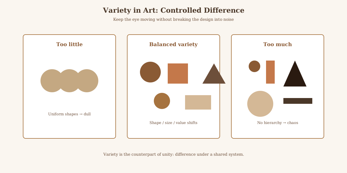
Variety means changing something on purpose, size, hue, value, texture, direction, or spacing, so repeated elements do not put the viewer to sleep. BBC Bitesize and parallel design-education glossaries list variety among the principles that organize the elements of art, alongside unity, balance, emphasis, and rhythm [BBC Bitesize: Principles of design (variety/unity context), checked 2026-10-26].
The National Gallery of Art's elements-and-principles teaching materials frame the same pair: elements are the raw ingredients; principles (including variety and unity) are how artists arrange them [NGA: Elements of Art teaching resources, checked 2026-10-26].
| Principle | What it changes | Fail mode without it | Quick studio check |
|---|---|---|---|
| Variety | Difference among elements | Monotony; flat scan | Can you name three deliberate contrasts? |
| Unity | Belonging / coherence | Chaos; collage of leftovers | Do contrasts share a palette, motif, or edge quality? |
| Emphasis | Focal priority | No place for the eye to land | Where does the strongest contrast sit? |
| Rhythm / repetition | Patterned return of a motif | Either drone or noise | Is a repeated shape varied in scale or color? |
Elements of art (line, shape, form, space, color, value, texture) are the raw ingredients. Principles such as variety, unity, balance, emphasis, and rhythm describe how those ingredients are arranged. Confusing an element with a principle is the first critique vocabulary error.
Variety is measurable in critique language: you should be able to point at two places on the work and name what differs. If you cannot point, you do not yet have a variety claim.
How artists create variety without breaking unity
Common levers: alternate large and small shapes; shift from smooth to rough texture; place a warm accent in a cool field; break a grid with one diagonal; vary line weight inside a hatch. Each lever is a difference the viewer can name in a critique.
Unity keeps those levers honest. A limited palette, a recurring silhouette, or a consistent light source can hold aggressive variety together. Design primers treat "variety in unity" as the paired homework, not as rival slogans.
Umberlore's art-fundamentals and technique guides treat variety and unity as a pair. Read this page for the contrast half of that pair; look for unity definitions in design primers and museum education glossaries linked in Sources.
Painters often vary brush length and pressure inside one color family so the surface stays alive while hue stays calm. Printmakers vary line weight inside a hatch. Photographers vary focal sharpness and light temperature across a frame. Same principle, different tools.
Too much variety on every axis at once usually destroys emphasis. Design teachers therefore assign limited-palette studies that force variety into value and shape while hue stays disciplined.
Critique script you can reuse
Name the element that changes (color, value, texture, scale). Name how often it changes. Name what stays constant so the work still coheres. If you cannot name the constant, you may be looking at clutter rather than variety.
If everything changes at once, ask whether emphasis is lost. Variety that fights the focal point is usually a staging problem, not proof that variety is "bad."
Student work often under-varies value while over-varying hue. Squint test: if the composition goes flat when color disappears, add value variety before adding more pigments.
When two student works feel equally "busy," compare whether their variety serves emphasis. One busy page may still have a clear lightest light and darkest dark; the other may scatter midtones. That value check often separates useful variety from noise faster than counting how many hues appear.
Teachers sometimes ask for a written inventory: list three repeated elements and three varied attributes. If the inventory is empty, the assignment was not variety; it was invention without a plan.
Write the critique in three sentences maximum for practice: (1) what changes, (2) what repeats, (3) where the eye is meant to land. That triad exposes whether variety is serving emphasis or just making noise.
Peer reviews that only say interesting composition without naming a changed element are incomplete. Demand the element name.
Worked levers with named checks
Use museum-education style checks you can perform on any reproduction, including open-access collection images.
| Lever | What to measure | Studio fix if missing |
|---|---|---|
| Value | Lightest light vs darkest dark distance | Squint; if flat, add value variety |
| Scale | Largest shape vs smallest repeated motif | If sizes match, vary one cluster |
| Texture | Smooth field vs rough accent | Touch with eyes; name the contrast |
| Hue/temp | Warm accent in cool field (or reverse) | One accent usually beats five competing hues |
| Direction | Dominate axis vs one opposing diagonal | Opposing line should be intentional |
BBC Bitesize and National Gallery of Art education pages frame these levers inside the wider principles list. Getty teacher PDFs on principles of design offer parallel classroom language you can cross-check in Sources.
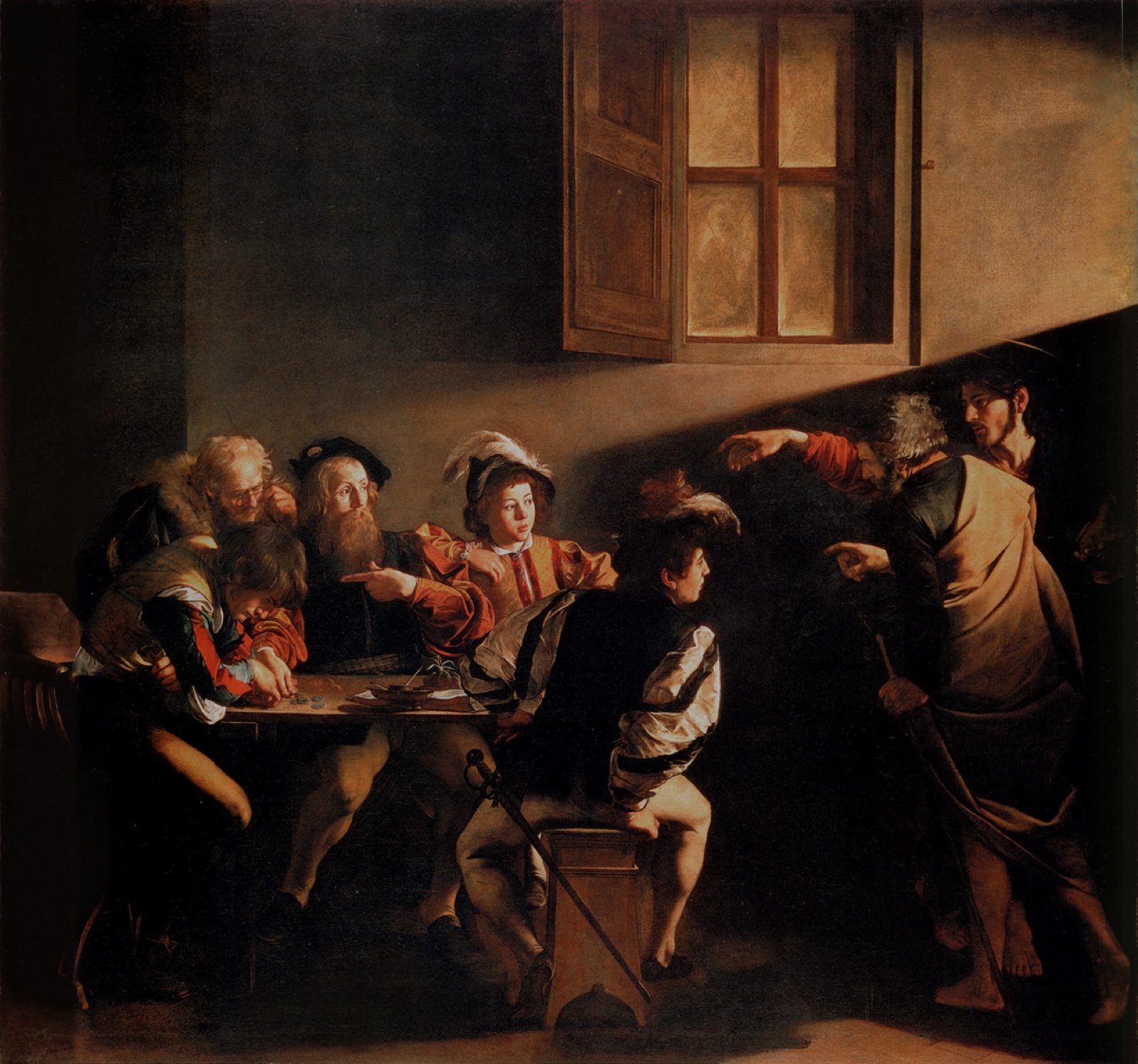
Assignment idea: pick one public-domain painting and fill the five-lever table with concrete observations (for example, left third smoother than right third). Empty cells mean you have not yet found variety on that lever, not that the work failed history.
Unity partnership and common student errors
Unity is not the enemy of variety. Recurring silhouette, limited palette, consistent edge quality, or a single light direction can hold aggressive contrasts together. Critique both: name the differences and name the glue.
Error A: confusing variety with adding more objects. A crowded still life can still be monotone in value. Error B: confusing unity with repeating the same stamp. Perfect clones without a varied attribute read as pattern, which may be intentional rhythm or accidental boredom.
Error C: using variety as praise without evidence. Error D: calling any busy page chaotic without checking whether contrasts are planned. Both errors skip the pointing test.
Error E: chasing hue variety while ignoring value. The squint test catches E quickly.
Teachers can grade a short inventory: three repeated elements, three varied attributes, one sentence on emphasis. That inventory is the artifact this page wants students to leave with.
Umberlore art-fundamentals guides treat variety and unity as a pair. Read this page for the contrast half; keep unity definitions from the museum education glossaries linked below beside it when you teach.
Studio session plan (45 minutes)
Minutes 0-5: define variety as planned difference among elements; define unity as the glue. Write both on the board without synonyms that blur them.
Minutes 5-15: students fill the five-lever table on a projected public-domain work. No phones for hue-name apps; eyes first.
Minutes 15-25: each student revises a thumbnail sketch to add exactly one new variety lever while keeping one unity glue unchanged. Constraint prevents chaos.
Minutes 25-35: partner critique using the three-sentence script (what changes, what repeats, where the eye lands).
Minutes 35-45: group share of one fail (monotony or clutter) and one fix. Collect inventories for grading.
| Diagnosis | What you see | First fix |
|---|---|---|
| Monotony | Almost no measurable difference | Add one lever from the five-lever table |
| Clutter | Many differences, no glue | Choose a palette, motif, or light as unity |
| Misaimed variety | Strong contrast far from focal point | Move strongest contrast toward emphasis |
| Hue-only variety | Many colors, flat value | Squint test; rebuild value first |
This session plan is the click-reason artifact for teachers: a timed procedure with pass criteria, not a vague essay about creativity.
Assessment note: grade the inventory completeness before grading taste. Students can dislike a work and still pass if they named levers accurately.
Keep a printed copy of the troubleshooting table beside the easel so mid-critique fixes stay specific.