The contrast in one glance
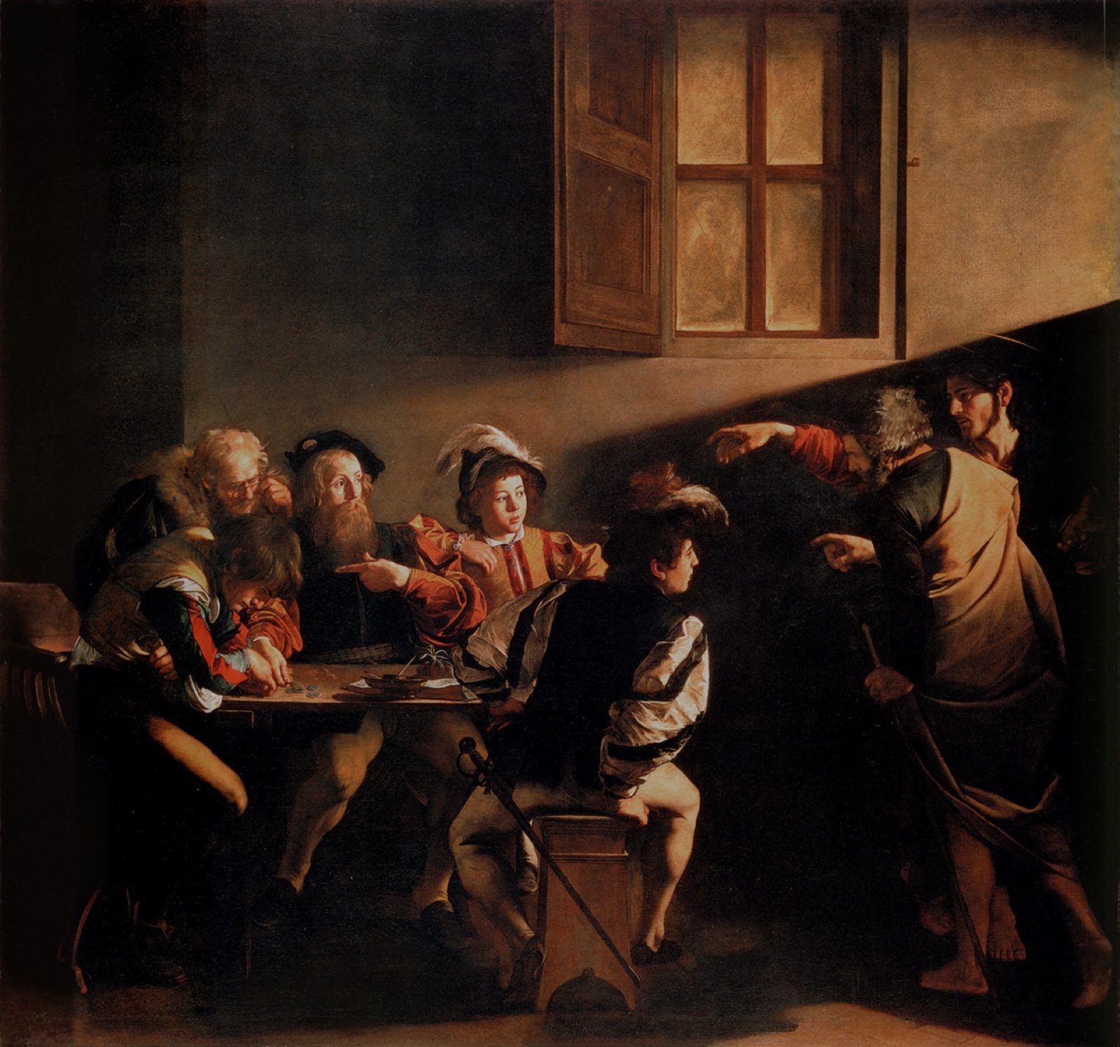
The National Gallery's glossary calls Baroque, for painting and sculpture, large usually seventeenth-century works of a dramatic and exuberant nature that use diagonal compositions and illusionistic effects to impress the viewer, naming Rubens and Bernini (National Gallery: Baroque).
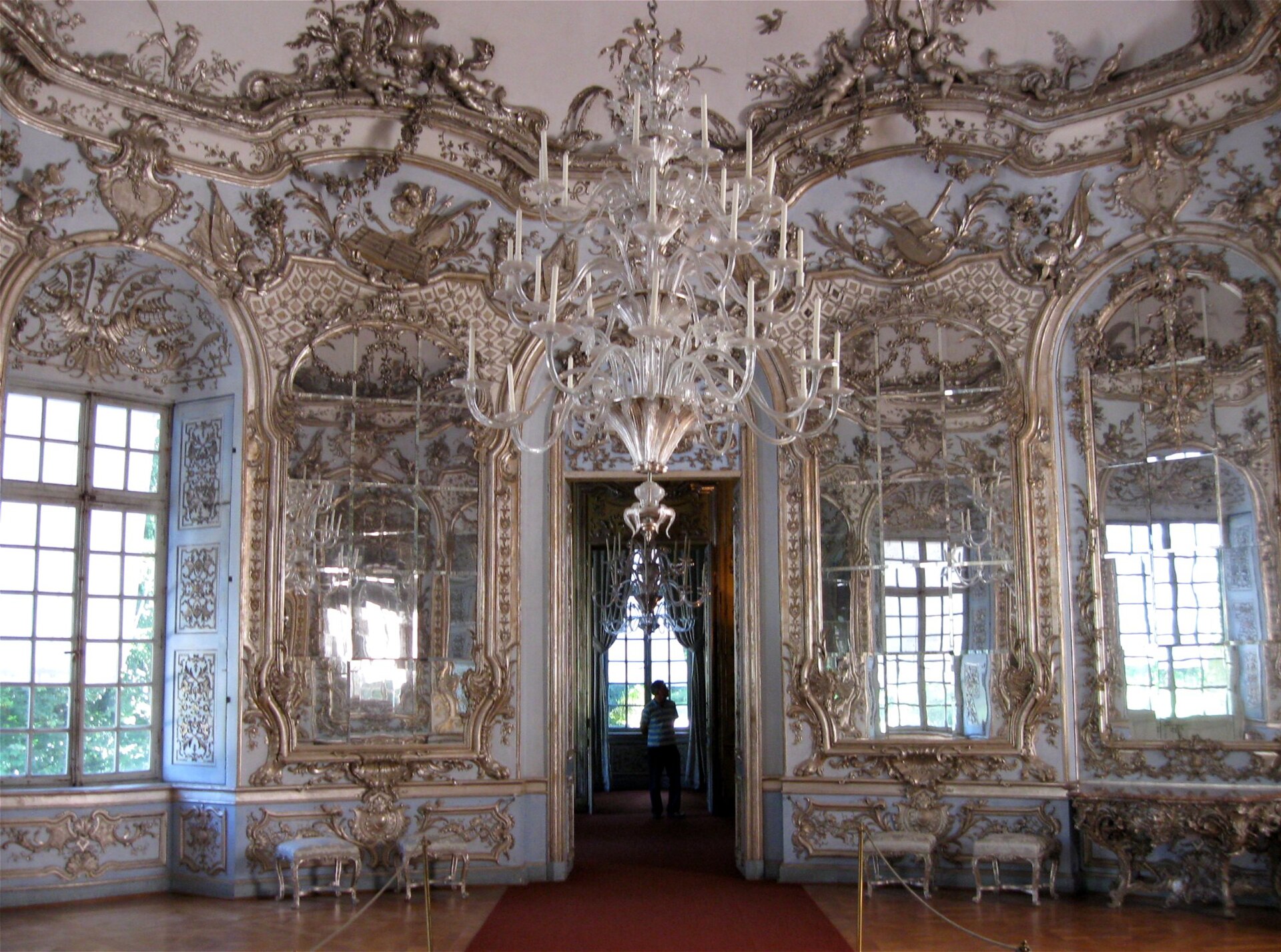
The same museum's Rococo entry ties the label especially to painting, interior decoration and architecture popular in France during the reign of Louis XV (1715-1774), based on natural forms, asymmetry, curved forms and light bright colors (National Gallery: Rococo).
Tate dates Rococo as a reaction to Versailles-scale Baroque grandeur after Louis XIV died, and derives the name from French rocaille, rock-work based on shells and corals (Tate: Rococo).
Baroque: force and spectacle
Tate places Baroque's height in Rome from around 1630 to 1680 and says its dynamic movement, bold realism and direct emotional appeal suited a reinvigorated Catholic Church (Tate: Baroque). The style also covered portraits, still lifes and mythological subjects outside church walls.
Tate's exemplar list runs from Bernini in Rome to Rubens in northern Europe, including Rubens's Banqueting House ceiling for Charles I in London, and to Van Dyck as Charles's court painter from 1632 to 1641.
The National Gallery stresses the aim: impress the viewer. Diagonal thrust and illusionistic depth are tools for that aim, not optional ornaments.
Rococo: after Versailles
Tate's Rococo entry is almost a checklist of surfaces: short curves, scrolls and counter-curves, often elaborated with fantasy. In painting it points to Boucher, Fragonard and Watteau, and in sculpture to Clodion.
Britain received a version through Philip Mercier, principal painter to the Prince and Princess of Wales, Tate notes, with Hogarth offering a robust local take and Gainsborough's female portraits showing the style's dazzle.
The National Gallery adds that Neo-classicists of the late eighteenth century first applied Rococo as a derogatory label. The prettiness that later taste mocked is exactly what the style was built to deliver.
Architecture note and related pages
This page is about the painting and decorative-arts contrast. For building fabric specifically, UmberLore already has Rococo architecture vs Baroque. For light-and-dark technique inside Baroque painting, see chiaroscuro vs tenebrism.
Architecture and interiors: reading a room
Baroque architecture (think Roman churches after the Counter-Reformation, or grand princely projects across Catholic Europe) leans on big spatial drama: curved walls, deep niches, paired columns, ceilings that open into painted heavens, and approaches designed to impress a procession. Light is staged. Ornament serves awe.
Rococo interiors, especially in early-to-mid eighteenth-century France and related courts, scale the drama down to salons. Asymmetry, shells, scrolls, pale gilding, mirrors, and intimate decorative programs replace thunderous nave theatrics. Furniture, boiserie, and small sculptural accents matter as much as the shell of the room.
A quick walk-through test: if the space wants you to feel tiny before a sacred or princely spectacle, you are warmer to Baroque. If it wants witty conversation under pastel curves, you are warmer to Rococo. Hybrid buildings exist; label the dominant campaign and date before you force a binary.
Regional flavors
Italian Baroque painting and architecture set early templates (Caravaggio's tenebrism in painting; Bernini's fusion of sculpture and space). Spanish and Latin American Baroque often intensify religious affect and surface richness. Dutch and Flemish contexts complicate the story with Protestant patronage patterns and different genre priorities.
French Rococo is the textbook core for decorative arts, with German and Central European variants that sometimes push church interiors into exuberant Rococo stucco even where the floor plan still remembers Baroque pilgrimage churches. England absorbs both languages selectively through Palladian taste and later decorative fashions.
Tate and National Gallery glossary pages stay high-level on purpose. Use them for the contrast pair, then open a local museum label for the city you are standing in.
Painting contrast with named anchors
Baroque painting vocabulary often includes strong diagonals, theatrical light, and bodies caught mid-action. Religious and mythic subjects carry Counter-Reformation or court agendas. Still life and genre scenes can still be "Baroque" in period without looking like altarpieces.
Rococo painting favors lighter palettes, flirtation, fete-galante leisure, and decorative integration with interiors. Pastoral play and myth as costume party appear more often than martyrdom cycles. The emotional temperature drops from thunder to murmur without becoming trivial when you read it as elite social art.
Pick one Baroque altarpiece and one Rococo salon canvas in the same museum if you can. Compare how much dark ground you see, how crowded the diagonal thrusts are, and whether the frame feels like a window onto drama or a jewel on a wall.
How "Rococo" became a slight
Neoclassical critics in the later eighteenth century used Rococo as a charge of frivolity: too much ornament, too little moral seriousness, too close to aristocratic play while politics hardened. The insult stuck in textbooks even after museums rehabilitated the style as historically coherent design.
Baroque had its own critics (excess, propaganda, illegible ornament), but nineteenth-century narratives often kept Baroque as powerful and Rococo as pretty. Knowing that value history prevents you from treating glossary tone as neutral science.
Today both labels are period tools, not moral grades. Use them to date and describe. If a wall text says "Rococo" with a sneer, ask whose eighteenth-century argument is being repeated.
Related pages and study path
On UmberLore, pair this contrast with architecture-focused Rococo-versus-Baroque notes and with light techniques such as chiaroscuro versus tenebrism when your question is about paint handling rather than salon design.
A solid afternoon path: read Tate Baroque and Rococo entries, walk one museum room from each century band, then write five adjectives that differ. Keep politics and patronage in a separate paragraph so style words do not swallow history.
If your assignment needs primary objects, cite the museum accession and date rather than only a style adjective. Style labels move; objects stay.
Sculpture, music, and neighboring arts
Baroque sculpture often extends the same theatrical brief as architecture: figures twist through space, drapery catches imaginary wind, and viewers are pulled into a moment of revelation. Bernini's chapel work is the classroom shorthand for that fusion of marble, light, and setting.
Rococo decorative arts spread the style through porcelain, silver, and furniture where asymmetry and shell motifs travel more easily than a whole church fabric. Sculpture can be smaller, garden-scaled, or integrated into boiserie rather than dominating a crossing.
Music and theater histories use Baroque for an earlier, broader seventeenth-to-mid-eighteenth band that does not map one-to-one onto Rococo rooms. Do not force a Bach-versus-salon parallel unless your course explicitly builds that bridge.
For visual-art students, stay with buildings, interiors, and canvases first. Borrowing music period labels without a syllabus map creates false precision.
When UmberLore points to chiaroscuro or tenebrism pages, use them for light technique inside Baroque painting, not as synonyms for Rococo decoration.
Object short-reads you can reuse
In a Baroque church: note the approach axis, the altar focus, and whether ceiling paint dissolves the architecture into vision. Write one sentence on motion and one on light.
In a Rococo salon: note mirror placement, gilt versus pastel balance, and whether ornament looks pinned-on or grown from panels. Write one sentence on intimacy and one on asymmetry.
In a gallery of paintings: pick a martyrdom or miracle scene and a fete-galante or pastoral flirtation. Compare diagonal thrust, shadow depth, and how much of the canvas is brown ground versus high-key color.
Those three drills, repeated in any city with a church, a historic interior, and a museum, will teach the contrast faster than memorizing adjective lists.
Revision notes for readers
Re-read the definitions section first, then the practical or historical sections that match your assignment. Skimming only the comparison table leaves out the process details reviewers expect at UmberLore length.
When you cite Tate or National Gallery glossary pages, add the access date in your notes because wall texts and glossary wording can be edited without notice.
If two sources disagree on a dating band, prefer the museum label for the object in front of you and treat encyclopedia ranges as approximate.
Keep studio safety and conservation claims modest unless you are quoting a manufacturer tech sheet or a conservator publication. Style history and material safety are related but not identical topics.
Finally, write one sentence in your own words that a classmate could falsify. If you cannot state a falsifiable contrast, you are still in adjective fog rather than in art-historical comparison.
Patronage, politics, and who paid
Baroque's big religious programs often answer Counter-Reformation and princely needs for persuasion at scale: clear focal points, emotional clarity from a distance, and architecture that catechizes bodies as they move. Court Baroque uses similar tools for dynastic glory.
Rococo patronage clusters around aristocratic and upper-bourgeois interiors where daily sociability is the stage. The budget shifts from facade rhetoric toward paneling, painting cycles sized for rooms, and objects handled at arm's length.
Money does not invent style alone, but it explains why a pilgrimage church and a Paris hotel particulier rarely look interchangeable even when both are ornate. Ask who walked through the door and what they were supposed to feel.
When a secondary source skips patronage, add one sentence yourself naming church, crown, or private salon. That sentence often resolves whether Baroque or Rococo is the better working label.